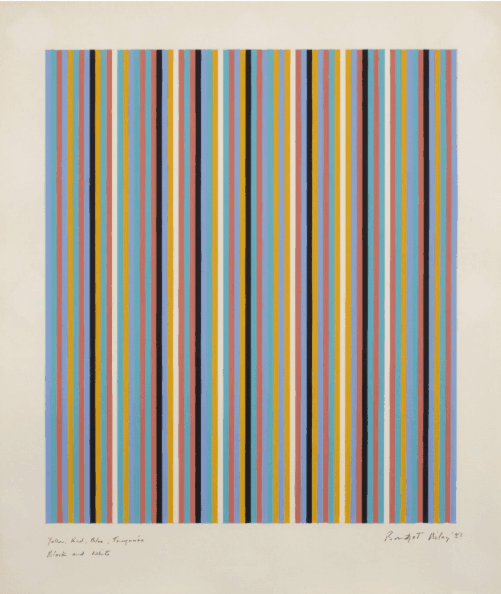
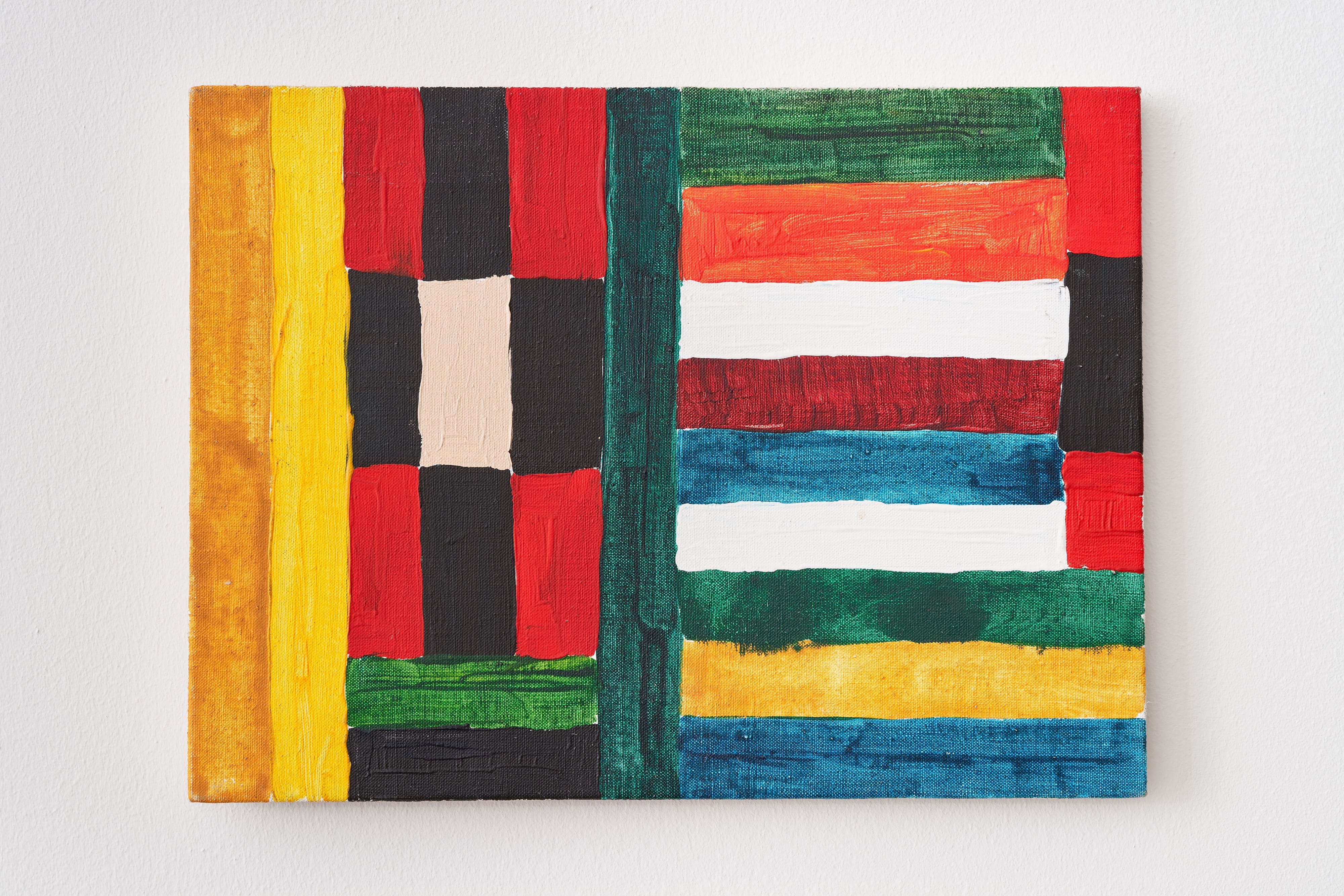
Yellow, Red, Blue, Turquoise, Black and White (1981) reflects Bridget Riley’s mature exploration of colour, perception, and geometric abstraction. Born in London in 1931 and raised partly in Cornwall during the Second World War, Riley developed a keen sensitivity to light, landscape, and visual perception that shaped her artistic practice. After studying at Goldsmiths’ College and the Royal College of Art, she experimented with drawing before turning to abstraction, inspired in part by Georges Seurat’s colour theories. Her breakthrough came in the early 1960s with black-and-white paintings that used simple geometric forms to create striking optical effects, earning international recognition through The Responsive Eye exhibition at the Museum of Modern Art in New York in 1965. By the late 1960s, Riley had introduced colour into her work, investigating how carefully calibrated hues could generate movement and spatial instability. Painted in 1981, Yellow, Red, Blue, Turquoise, Black and White belongs to a period influenced by her travels in Egypt, where the vivid palette of ancient Egyptian art inspired her return to simple vertical stripe compositions in which colour became the principal source of rhythm and sensation. The painting is composed of vertical bands of yellow, red, blue, turquoise, black, and white, arranged with precise intervals to create a dynamic visual rhythm. While the structure appears regular, the interaction of warm and cool colours produces subtle optical vibrations that make the surface seem to shift and pulse. Black and white sharpen the transitions between colours, intensifying their brilliance, while the repetition of vertical forms creates a balance between order and movement. Rather than using perspective to suggest depth, Riley relies on the relationships between adjacent colours to make the stripes appear to advance and recede, creating a constantly changing visual experience. Through this carefully controlled composition, Riley demonstrates how the fundamental elements of painting—colour, line, interval, and proportion—can generate movement, energy, and an active engagement with the viewer’s perception.
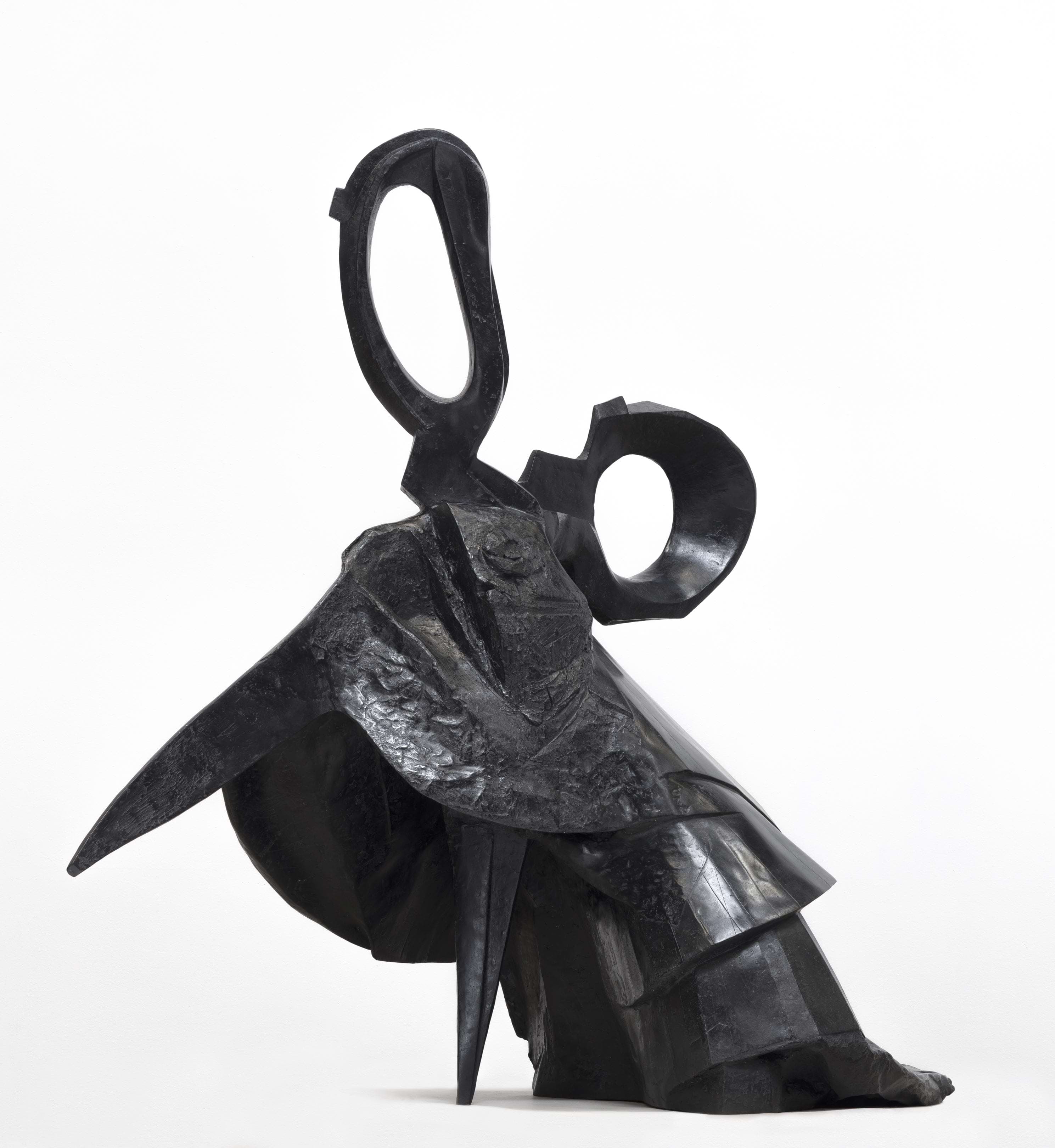
Cut, Her and Pour are part of Kentridge’s ongoing Lexicon series. Acting as a visual dictionary, the sculptures form a vocabulary of symbols, or ‘glyphs’, representing a collection of everyday objects, suggested words, or icons that are ubiquitous in the artist's broader practice. Pour is the newest addition to this collection of bronzes.
Video
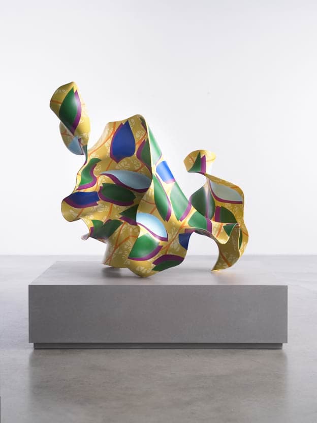
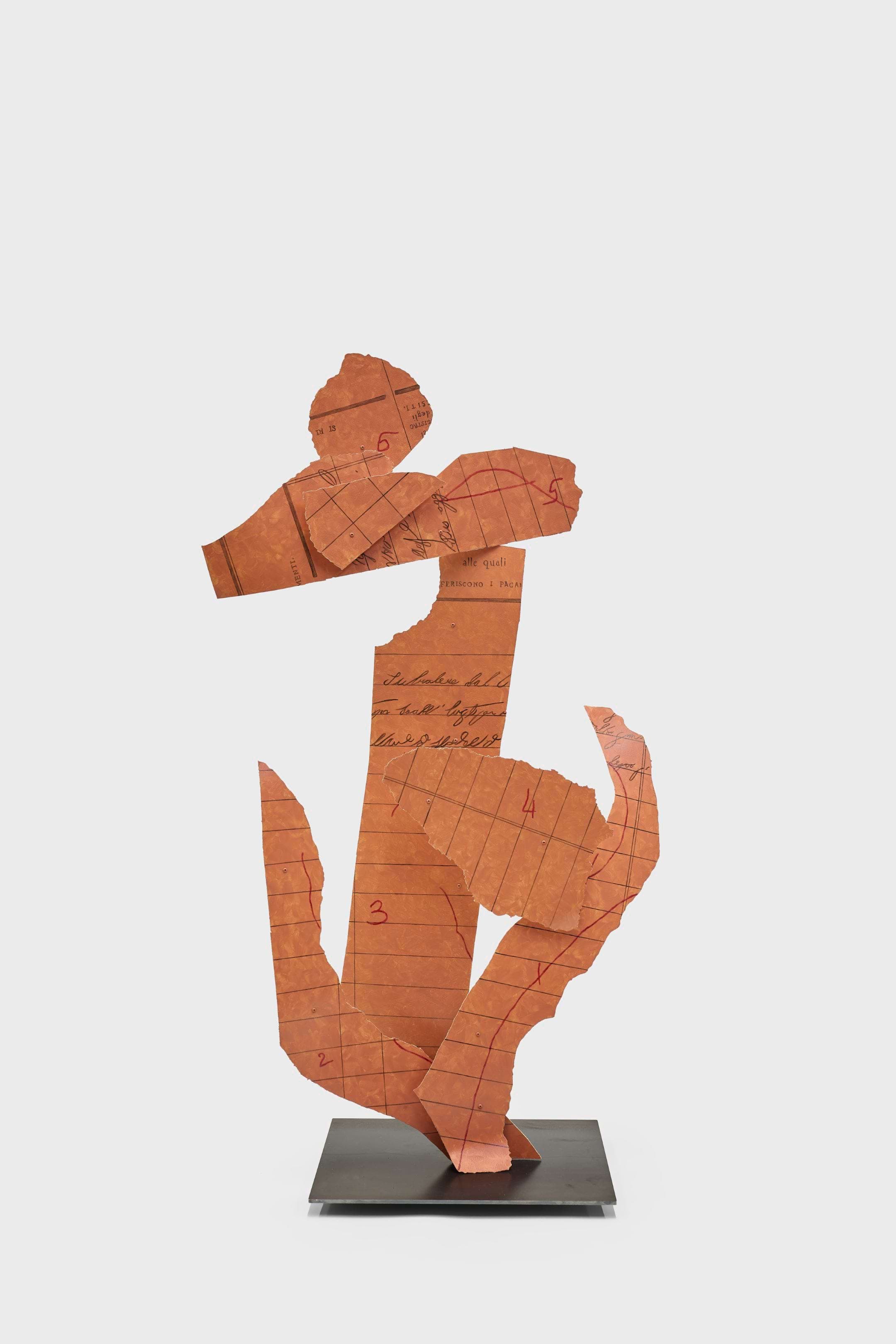
'Paper Procession VI’ forms part of a set of new hand-painted, aluminium and steel sculptures in vivid colour. The origin of these sculptures are a series of small paper sculptures, made from the torn and coloured pages of a 19th century accounting journal from the Chiesa di San Francesco Saverio in Palermo. This ‘Paper Procession’ speaks to the process of costume-making. During periods of intensive workshops in the making of a theatre production, Kentridge and his collaborators work with paper as a way to think about costumes, and their colours.
In 2019, the Norval Foundation in Cape Town, South Africa opened William Kentridge’s acclaimed exhibition Why Should I Hesitate: Sculpture, which is the first exhibition to internationally address the artists’ output as a sculptor. The exhibition highlights Kentridge’s longstanding improvisation in handling the medium of three-dimensional form, presenting objects cast in bronze that see their origin in props from his theatre productions and operas, as well as images from his widely known charcoal-based film animations.
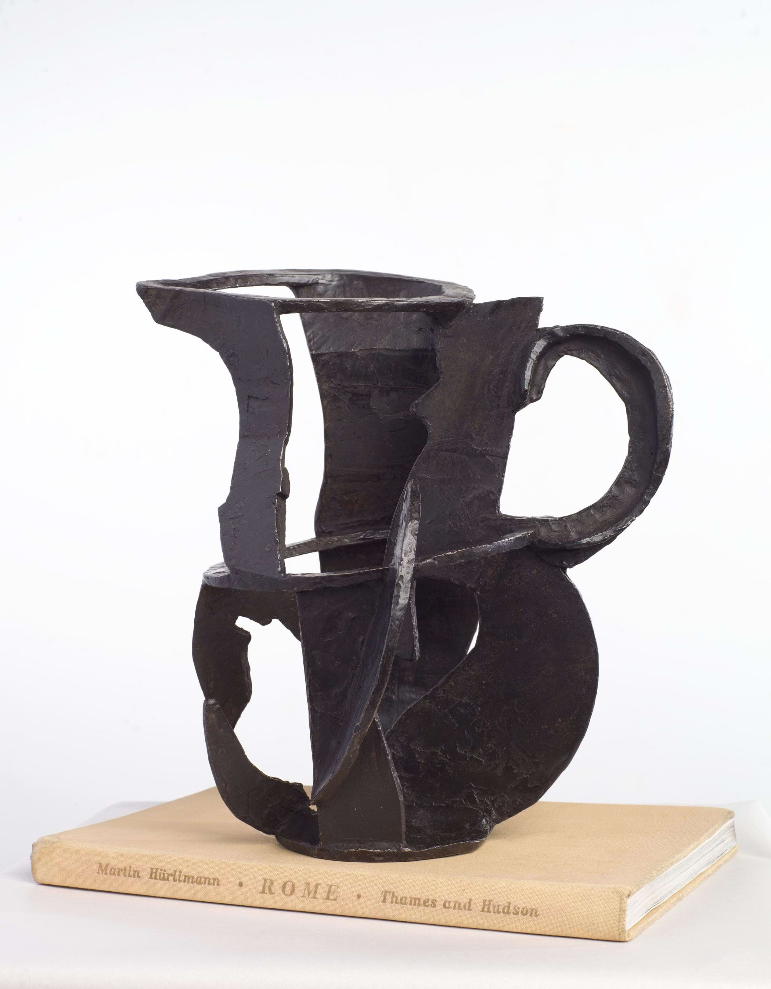
Kentridge is admired for the simplicity and the immediacy of the images that he creates. As an extension from the iconic erasure-based charcoal drawings of Drawings for Projection, Kentridge began to explore other techniques that would reduce the amount of intentionality and control over a medium and it’s subject. The act of tearing black paper, leaving the final shapes that are formed up to chance, suggests how expressive an artist can be to create shapes that a viewer can apprehend as an image or an object. These shapes could then come to life as a bronze sculpture, as seen in Jug.
Megaphone Man and Jug are examples of Kentridge’s earlier explorations in the medium of bronze. Made in the same manner as the game of puppets he would play with his children on their birthdays, where puppets are created out of found objects around the house, these bronzes are born out of improvisation and a way of working without expectation or the pressure of an end result.